分享到微信,
请点击右上角。
再选择[发送朋友]
或[分享到朋友圈]

中国美协理论委员会副主任、中国油画学会理事、《美术》执行主编 / 尚 辉
Written by Shang Hui
Vice Direct of China Artists Association Theoretical Committee
Member of China Oil Painting Society
Executive editor of
中国油画的本土化显然是个艰难而需要持久探索的一个命题。这种艰难与持久,除了人们已经认识到的用移植而来的油画去不断切合建立在本土文化审美心理上的、具有本土地貌气候光色特征的色彩谱系外,还有人们未必完全认识到的是否能够真正理解或驾驭那些在欧洲艺术史上沉淀下来的精湛的油画造型与色彩。譬如,印象派对于光的分析而重构油画色调与色相的绘画原理,是我们知悉的(这是美术史的知识),甚至于我们现在也能够经常赴欧美一些大美术馆直接观摩印象派那些大师在运用这些色彩原理时进行的个性化的精彩创造,但了解认识是一回事,能否在自己的手上真正驾驭和创作则是另一回事。中国油画长期缺乏色调、缺乏色彩、缺乏光感,已是不争之事实。这种集体性的色彩失语,或许表明了一种民族认知与表现色彩的缺陷,而如果不能画出具有油画感的光色,那么中国油画的那些本土性特征也将会失去油画本体的魅力,这种本土化也毫无疑问会缺乏艺术史的创造高度。
The localization of Chinese paintings is obviously a difficult thesis that need a persistent exploration. This kind of difficult and persistence, besides people have recognized that they can use the transplanted oil paintings to meet the color spectrum constantly which is established on the native culture aesthetic psychology with local color characteristics of topography and climate light , in addition, people may not be fully aware of whether they can truly understand or manage those exquisite painting styles and colors what are deposited from European art history . For example, the Impressionism painting principles about optical analysis and reconstruction of tone and hue in oil painting, that is what we know (this is the knowledge of art history), even more, now we can often visit some big museums in Europe and the United States, directly observe the personalized wonderful creations of the Impressionists by using of the color principles, but the understanding is one thing, whether you can truly control and create is quite another. Chinese paintings are lack of tone, color, light perception in a long term, that is an indisputable fact. The collective color-aphasia perhaps indicates the national deficiencies of cognition and color expressing, and if light perception color cannot be drew in the paintings, the localization features of Chinese painting will also lost the charm of paintings in themselves, this kind of localization is lack of highly creating in art history without question.
可见,在当代中国油画的演进中,那些看似已经是艺术史完成的篇章其实并没有在本土实践中得到深入的解决,如果要提高到本土化的层面来认识,那么,中国油画的色彩建构似乎才刚刚起步,甚至于还保留着大片大片的处女地。洪瑞生数十年对于油画艺术的探索,显现的既不是他对于历史与现实题材进行史诗叙事的兴趣,也不是他对于现代主义艺术观念或风格图式的追逐,而是对油画本体的油彩意蕴以及闽南地域独特的色彩谱系的摸索,他画出了鼓浪屿的阳光、画出了阳光普照在闽南红土地的那些风物上所弥散出的炽热温度,他发掘了闽南油画这个地域性特征相对完整的光色谱系。
It can be seen that, in the evolution of Chinese contemporary paintings, those chapters that seem to have been finished in the art history does not be deeply solved in the regional practice. If raising the cognition in the level of localization, the color construction of Chinese painting seems on a long way to go, so far as to have great area of virgin land. Hong Ruisheng’s exploring of oil painting in many years shows neither his interesting on epic narration of historical and realistic themes, nor his pursuing of modernism artistic concept or style, but the exploring of the paint sense and unique color spectrum in Southern Fujian. He paints the sunshine of Gulangyu Islet, the high temperature from the scenery and customs on the red earth of Southern Fujian. He finds out the relatively complete color spectrum with the localization features of Southern Fujiang paintings.
画鼓浪屿的岛与海、画闽南的红土地、妈祖庙与惠安女的油画家不在少数,但大多停留在所画即所见的层面,也即,见透明的天用蓝色,看纯净的云用白色,视平静的海用翠色,这些画作就是用纯度再高的色彩似乎也画不出阳光照射在海岛上的那种湿润的空气中闪烁的光色。其实,油画色彩的魅力并不在于你能用多高纯度的色彩,也不在于你能用多少种变化的色调,而在于探寻和建构色彩之间有意味的关系。洪瑞生的《波远涛声近》(2010)之所以具有阳光下海岛的光色感,并不在于他把远处的海画得多么的蓝、岛上的景物画得多么的烈,而在于他用土黄为基色,把画面上所有的色彩变奏都统一于这种橙黄色调中——白云不是白色,而是被画成暗于近景亮度的铁黄;远处海涛也不是纯度很高的湖蓝或群青,而是蓝灰之中也有适度的棕褐浸染;近景的岩石树木并非浓深的赭石配绿,而是被统一为金土黄基调里带出的几笔树汁绿、橄榄绿和茜草红。如果说画家更主观地去增强了那种阳光下的色温的话,那就是几乎用纯度极高的几笔朱红、茜草红来勾画那些洋楼的大坡顶和画面右侧那几株挺立的树干上的斜照。《山》(2001)、《云顶上的果树》(2001)和《厦门南普陀寺》(1993)等也都是这样。这几幅画作,均以土黄色系构成岛屿山岩的主体色相,天空的普蓝、橄榄绿因用土黄、深褐调整而相应变得沉暗,岛屿上的树木也被土黄、生赭和深褐所抑制,而画面最深的色彩则是熟褐中带着的茜草红,从而给人一种炽热色温的深刻印象。
The painters who paint the islands and sea of Gulangyu Islet, the red earth of Southern Fujian, Mazu Temple and Huian women are not in the minority, but most of them stay on the level of What You See Is What You Paint, that is, the sky is blue, the cloud is white, the quiet sea is green, all these paints can not express the sparkling light color in humid atmosphere on the little island by using the highest pure color. In fact, the charming of painting color does not consist in how pure the color you may paint or how many variable color you can use, but the meaning relationship of exploring and constructing the colors. the reason of his paint, Distant Waves Sound Clear(2010) , has the light perception of an island in the sunshine, that is not because he paint how blue of the sea faraway or how detailed the scenery of the island , but he use khaki as a primary color, all the color changes are integrated in the aurantiacus hue-- the cloud is not white, but a iron yellow darker than the brightness of the foreground; distant waves are not pure lake blue or ultramarine, but blue gray with moderate brown; the close stones and trees are not full color ochre with green, but integrated in gold yellow ochre hue with a few sap green, olive green and alizarin. If we say that the painter subjectively enhances color temperature in the sunshine, that is he uses almost a few of the highest purity vermilion, alizarin to delineate the high slope of those houses and the silhouette of the several direct branches on the right side of the paint. So he does in (2001), (2001) and (1993) . These paintings are painted in khaki system to constitute the main color of the island rocks, the blue and olive green of the sky turns dark with khaki and puce, the trees in the island is also restrained by khaki, raw umber and puce, and the deepest color in the picture is burnt umber with alizarin, so that it can give a impression of the hot color temperature.
显然,洪瑞生对于鼓浪屿阳光的捕捉,并不是画真实的所见,而是在这个海岛所承受的阳光下,用土黄色系(包括:淡黄、土黄、生赭、透明铁黄、印度黄、拿波里黄、金土黄、桔土黄等)、蓝绿色系(包括:土绿、橄榄绿、树汁绿、湖蓝、天蓝、皇家蓝、钴蓝、群青等)和棕褐色系(包括:朱红、镉红、安吉利科红、土红、威尼斯红、茜草红、透明铁红、赭石、熟褐、生褐、绿褐、范代克棕、深棕和茜草棕等)这三种色谱构成的冷暖变化,从而形成画家既是对闽南地域性色彩的客观提炼,也有主观意象性发挥的本土性色彩探索。而在这三个色系中,土黄色系与棕褐色系或许是洪瑞生创造海景阳光感油画的关键。因为海岛风光在人们印象中以冷色系为主,但洪瑞生却使用土黄色系与棕褐色系用来呈现那些受光部位(这在一般作品里往往被画成白色或浅冷色)。这种色调的重新配置,有些像英国透纳画海景的方法,也是洪瑞生用暖色替代泠色而表现闽南独特的阳光色温的自我探索。在洪瑞生1992年创作的《闽南渔船》中,虽然天空与船体及倒影仍然是蓝绿色调,但沙滩已被铺上桔黄与土黄,而闽南渔船在船舷和船艉特有的大红漆饰,则更增添了画面冷暖对比的光照感。2014年创作的《鹭海雄风》完全将天空的白云与海岸的沙滩幻化为桔红与土黄色相,这一方面体现了画家对于暖色的主观想象与发挥,另一方面也表明了画家在土黄色系、棕褐色系和蓝绿冷色系之间形成的某种固定配置。他的《平静的海》(1995)甚至于把大片的朵朵白云都变幻成夹杂着茜草红和深棕的厚实的土黄光色,天空与海面则被大胆地夸张为橄榄绿、土绿和绿褐,这种变奏其实正是他的阳光色彩谱系形成后的一种对象化。与《平静的海》以暖色调为主不同,《海天一色》(2003)完全以蓝绿色概括一色的海天,富有意味的是,画家在那些渔船的色相上完全用土黄、铁红与朱红来对冲,既达到了色彩的饱满概括,也具有色彩的丰富含蓄。描绘莲池对于晨曦微光反射的《天光》(2008),虽不像《海天一色》那样用色饱满,但同样体现了莲池所形成的蓝绿色相与晨曦微照的棕褐之间形成的一种关系,只不过这种比对显得更为柔和罢了。
Obviously, Hong Ruisheng’s catching of sunshine in Gulangyu Islet is not what he see with his eyes, but in the sunshine of the island, with three color spectrum of khaki color system (including: light yellow, khaki, raw umber, transparent iron yellow, Indian yellow, Naples yellow, gold yellow ochre, and orange yellow ochre,etc.), blue-green color system (including: soil green, olive green, sap green, lake blue, sky blue, royal blue, cobalt blue, ultramarine, etc.), tan color system (including: vermilion, cadmium red, Angelico red, reddle, Venetian red, alizarin, transparent oxide red, ochre, burnt umber, raw umber , green brown, Van Dyck brown, brown madder alizarin, etc.), there constitute the changes form cold to warm, thus, the painter refine objectively not only the localization color of Southern Fujian, but subjective exploring of the locality color. However, in the three color systems, khaki color system and tan color system perhaps are the key of Hong Ruisheng’s painting with sea sunshine perception. As the island scenery is dominated by cold colors in the public imagination, but Hong Ruisheng uses the two color system to express the light parts (these parts in general paintings are often painted in white or light cold colors). The tone reconfiguration seems like the British Turner seascape painting method, and also is Hong Ruisheng’s self-exploration of expressing the unique sunshine color temperature in Southern Fujian via warm color instead of cold. In painted by Hong Ruisheng in 1992 , although the sky,the boats and the reflections were still blue-green tones, but the beach was covered with orange and khaki hue, the sides and stern in the fishing boats are painted in deep red that lent the light perception of the picture in contrast to warm and cold color. In created in 2014, the clouds in the sky and coastal beaches were completely turned into orange and khaki hue, on the one hand it can reflect the painter's subjective imagination and usage, on the other hand that meant some collocations had been formed among the three color systems in the paintings. In (1995), masses of clouds had been painted in brown thick khaki with alizarin, the sky and the sea was exaggeratedly painted in olive green, soil green and green brown, this variation was just the objectification after his sunshine color spectrum had been formed. Being different from the warm color in , adopted the blue-green to express the sea and sky. It was full of rich means that the painter completely use hedge of khaki, iron red and vermilion to make the color full and broad ,rich content as well. described the reflection of lotus pond to the morning, although it was not as full color as , but it also express the relationship between blue-green color hue of the lotus pond and tan color hur of the morning sunlight, nothing but the contrast looked more soft.
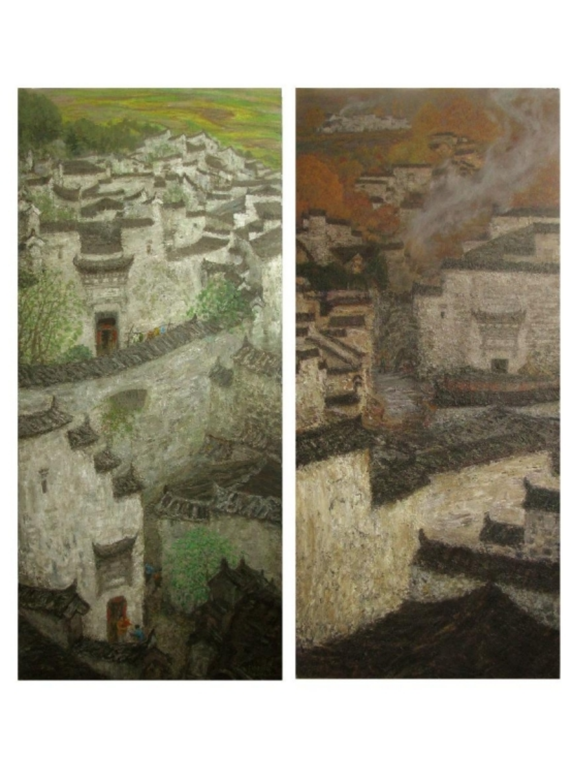
用土黄或棕褐去替代那些景物受光面的表现,不仅使洪瑞生的油画去掉了一般画家极易失范使用的白色或冷灰色,而且使他真切地表达了阳光在闽南湿润的空气中形成的闪烁感。在《初冬》(2007)和《郊野孟冬》(2014)作品里,画家高超地将冬日的阳光处理成金土黄、桔土黄与棕褐构成的基调,草绿、橄榄绿因被这种暖色浸润而成为极为精致的暖灰绿,尤其是树稍边缘的黄褐色与树干背后的红棕色,更增添了画面的光照感与透气感,小笔触米点似的点堆也使画面越加浑朴与厚实。土黄和棕褐还构成了画家表现闽南红土地与民居的基本色相,加之较为饱和的天蓝和深绿色植被,似乎也再次演绎了画家从表现鼓浪屿的海景所形成的固定色彩配置,只是这三种色彩谱系在画面的比例发生了相应变化而已。譬如《晌午》(2014)几乎把闽南民居完全处理成土黄、土红、熟褐、桔黄和茜草红这些热度感很强的色系,而相对缩小了天空的蓝色与植被的绿色,使画面的阳光感显得特别的强烈;《印象沙坡尾》(2014)同样以金土黄和朱红作为对岸民居的基色,形成了画面特有的阳光一片灿烂的深刻印象;而《闽南村口》(2012)则用土红、深褐画出妈祖宫庙、远处的民居以及整个山坡平地,其余则用深绿、钴蓝掺杂的熟褐而使画面显得浓郁而灿烂。
Replacing khaki or tan with the performance of lighting side of the scenery, Hong Ruisheng’ s painting removes not white or cool grey that general painter are easily anomie using , but he can clearly express the sparkling perception of the sunshine in moist air in Southern Fujian. In (2007) and (2014), the painter skillfully dealt with the winter sunshine in gold yellow ochre, and orange yellow ochre and ton color tone, grass green and olive green became fine warm grayish green for the soaking of this warm color, especially the yellowish brown at the edge of treetop and red brown behind of the trunk added the light perception and breathable sense, the little points like the rice grains also made the painting more deep and simple. The color of khaki and ton also made up the basic hues of the painter’s showing the red earth and houses in Southern Fujian, together with saturated color of sky blue and dark green vegetation, seem to perform the fixed color collocations formed from the painter’s expressing of Gulangyu Islet scenery once again, the only change was the proportions of the three color spectrum in the picture. For example, (2014) almost put the houses completely into khaki, reddle, burnt umber, orange and alizarin these strong heat sensation color, and relatively narrowed the blue sky and green vegetation, made sunshine sensation very strong in the painting; (2014) also used gold yellow ochre and vermilion as the basic color of across houses, formed the unique deep impression of brightly shining in the painting; in (2012) , Mazu Palace Temple, distant houses and entire hillsides were paint in reddle and ton, while the remaining was in dark green, burnt umber doped with cobalt blue that made the painting more strong and brilliant.
作为一个上世纪60年代毕业于中央美院吴作人画室的油画家,洪瑞生的大半生主要从事油画教学与创作,因而他的油画并非只有风景和静物,其主要精力还是画人体、肖像以及一些主题性创作。他在60年代画的《母亲肖像》(1963)就显示出儒雅含蓄的色彩运用;80年代的《戴草帽的乐师》(1982)、《渔市》(1982)、《五彩的集市》(1989)和《石工(午餐·岁月·哺育)》三联画(1983)等显示了他对现代主义结构性造型、表现性色彩和象征性寓意的多样探索;90年代后他才有机会赴欧美一些美术馆亲炙欧洲油画原作的艺术魅力,逐步意识到油画油性色彩关系的微妙神韵,他广泛研习了印象派、后印象派一些名家大师的色彩技艺,像《四川妹子》(1994)、《端坐的少女》(2016)和此期一些《女人体》等体现了他对莫奈、毕沙罗、雷诺阿和马蒂斯等大师的色彩研究。2000年之后,他创作的《春·水仙》(2002—2014)、《冬日的鼓浪屿》(2015)和《大集市》三联画(2002—2014)等显示了他在人物画方面对闽南浓郁的人文特征的色彩探索。
As a painter graduated from Wu Zuoren Studio of CAFA((Central Academy of Fine Arts) in 1960s, most of Hong Ruisheng’s life is engaged in painting teaching and creating, so his paintings are not only about landscapes and still-life, he mainly focus on human body, portrait and some thematic creations. His (1963) created in 1960s shows the elegance implicit color using; in 1980s (1982), (1982), (1989) and triptych of < Stoneman > (Lunch•Years•Feeding)(1983) display his diverse exploring on modernism structural style, expressive color and symbolic meaning; In 1990s, he had opportunities to visit some European and American museums and enjoy the charm of European original painting by himself, gradually realized the subtle verve of oil color relationships in the paintings. He broadly study the color skills of the masters of Impressionist, Post-Impressionist color technology, his paintings during this period,such as (1994), (2016) and some paintings of < Woman Body>, exemplified his color research of Monet, Pissarro, Renoir and Matisse and other masters. After 2000, he created (2002-2014), (2015) and the triptych of (2002-2014), these paintings showed his color exploration of humanistic characteristic in Southern Fujian at the aspect of portraits.
和上述对他的闽南风景色彩谱系的分析那样,他后期的这些人物画作,都体现了他对土黄色系、棕褐色系和蓝绿色系的提纯与再度发挥,尤其是《大集市》三联画,可以说是他花费十余年时间探索闽南本土光色谱系在人物表现方面的集大成之巨作,也是他继《五彩的集市》之后将表现性与光色融为一体的佳构。全画以土黄、土红和铁红为画面基调,表现了闽南璀璨的阳光下惠安女赶集的热闹场面,但画作并不以叙事为归旨,而是借此以色彩捕捉那一片灿烂的阳光下斑驳的光影与单纯的色彩谱系里呈现的丰富变幻。画作最亮的地方是画幅中间和右上侧用金土黄反复堆塑出的阳光下的人群与逆光的绿荫,其它部位则相应通过棕褐与深绿、翠绿来调整画面的冷暖与明暗。可以说,画家是在纯度极高的色彩里并在为数不多的颜色限定中求得冷暖与明暗的变幻,以此彰显画家对单纯与丰富的色彩创造。
As the analysis of his scenery color spectrum of Southern Fujian all above, his late portrait paintings are reflected his purification and second-time develop on khaki color system, tan color system and blue-green color system , especially the triptych of , in a manner of speaking, it is the brilliant pastiche that he spent more than 10 years to explore the regional color spectrum in Southern Fujian on aspects of portrait painting, it is also a good frame of mixing performance and the light perception following his painting . The whole picture is adopted the basic color of khaki, reddle and iron red, described the lively scene of Huian women going to marker in the brilliant sun. but the paintings are not taken the narrative as a purpose, but according to this scenery, captured the mottled light and shadow in the brilliant sunshine and the rich changes presenting in the single color spectrum presents.
The brightest parts of the painting is the crowd in the sunshine in the middle of the picture repeatedly painted in gold yellow orche and backlighting green shadow on the upper right, other parts is adjusted cold-warm and bright-dark in tan, deep green and emerald green. So we can say, the painter finds out the changes of cold-warm and bright-dark in high purity color and parvus limitation, so as to manifest the painter simple and plentiful color creation.
其实,印象派或后印象派那些色彩大师画作的精妙之处,也在于单纯中求丰富,并在暗中求鲜亮,远非人们所想的那样用尽一切靓丽奢华的色彩。在笔者看来,洪瑞生的那些发掘了闽南地域性光色谱系的油画以及浑朴厚实的笔触,同样体现了这种于单纯中见丰富的色彩真谛。基于此,他在绘画被日益图像化的当下对油画色彩意蕴的本土化探索,也便显得尤其可贵。笔者相信,他对闽南地域性油画人文特征与色彩谱系的探寻,必将会被越来越多的人所认知与赞赏。
As a matter of fact, the subtlety of the color masters’ paintings of Impressionism or Post-Impressionism is also seeking rich in simple, bright in dark, far from using all beautiful luxurious color as people attribute to it. In my opinion, Hong Ruisheng’s painting exploration discovering regional light spectrum, as well as simple and thick brush skill, also reflects true color essence of seeking abundant in simple. Based on this, his localization exploration of painting color meanings seem particularly valuable in the present that the painting s turn more visualization. As the writer, i believe his painting his exploration of regional painting humanistic and color spectrum in Southern Fujian will be accepted and appreciated by more and more people.
2015年9月19日于北京22院街艺术区
Sep. 19th , in Art Zone, No. 22 Street, Beijing
作者:尚辉


分享到微信,
请点击右上角。
再选择[发送朋友]
或[分享到朋友圈]