分享到微信,
请点击右上角。
再选择[发送朋友]
或[分享到朋友圈]

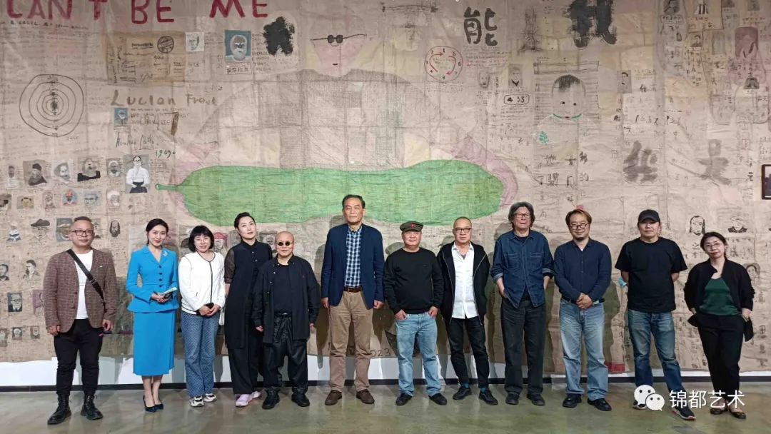
2006年6月初,南溪请我去看刚装修好的画室,画室地处北湖渠酒厂新开发的国际艺术园区,宽敞而又漂亮。南溪拿给我一瓶红酒,包装上的一个红点使我的视感觉受到了猛烈撞击,将水渍、染渍的意味和内涵在点中发挥得如此淋漓尽致者,我以前没有见过。我凝神注目着,那是在生宣上渗渍而成的图形。一圈一圈,圈圈不同;圆而不圆,不圆而圆;色冲墨,墨又冲色;浓淡相宜,疏密有致;艳中见雅,气象空灵;似大花,又似女性的“众妙之门”。虽“笔法全无”,却不仅可入画品而且可入上品。
南溪面露得意,说红酒包装是他设计的,红点是他作品的局部。酒,是为下旬在新画室举办的第一个展览“水墨性情”开幕酒会用的,那个展览与性有关,主持人贾方舟很满意这个设计。
我当时的第一个反应是:这局部就是绝好的独幅作品。
南溪后来画了一些单点的作品,可能是因为点子大了不好控制,终未画过这一个。
在南溪的作品《马术系列№3》的下角,我找到了那个红点,颜色要重一些,不及酒瓶上的空灵——南溪在电脑中对图像的明度做了精心处理。
他的新作最突出的特色是用网点组成图像,例如红色波普图像,时尚流行图像,围棋残局图像,老虎图像,马术图像等。这种方案并不值得惊叹,用网点组成图像在西方早已出现了多个变种。当然,这些作品的图像本身是具有中国特色和个人特色的,但如果仅仅满足于以此来肯定南溪的作品,显然又离开了“网点组成图像”这一要点。我认为南溪最重要的意义在点的突破。酒瓶上的点是一种象征,又是一种标高,南溪正是用在这个点中反映出来的作画态度,像圣徒一样来对待那千千万万个点的。南溪攻点凡20年,到这时,“南氏晕点”才算点血成形了。
与点的突破同步,南溪的另一种可以称为“南氏笔路”的东西也在迈向新境。这种笔路可以追踪到他2002年一批丙烯画的色块处理——Photoshop软件提供的一种类似套色版画而又不同于套色版画的简约色块效果。同年,在水墨画《何处是我家》中虎头和楼房的局部,适应于这种色块的笔墨方式开始萌芽。2005年以后,这种局部语素在他的画中不断蔓延,一点点将那些芜杂的笔墨语言排挤出去,2006年以后逐渐走向了纯粹。同样是红色波普图像,时尚流行图像,围棋残局图像,老虎图像,马术图像等,有的他用网点,有的则采用这种特殊的色块和笔路。
色块处理是由电脑图像挪移来的,这一点比较简单,难点在如何转化为笔墨语言。它的基本方式是大量采用润笔,在生宣上,润笔于未干时交笔会出现相互分离的水线,南溪有时就借助这种水线,塑造形体并使笔路清晰。利用这种分离机制作画,是一种常用技法,并不专属于南溪,“南氏笔路”主要特指另一种润笔技法:他在前笔阴干或半干时运行后笔,当后笔向前笔的边缘渗入时,会积叠成重线,南溪便利用这种积线,让他自然而然地形成造型的分界线、转折线、过度线。其实,这是一种早就有的积墨法,积墨交笔会出现一种时断时续,如虫啮木,如屋漏痕,自然成纹的线,这在许多人的画中都可以见到。那么,南溪笔路有什么特点呢?一在它和南溪挪移来的色块处理融为一体;二在薄积,往往仅两层,多也不过三四层,笔路由此而显得清新透明,积线由此而得到突出展现;第三点也是最重要的,他这种笔墨用了好几年,我之所以到2006年才愿意使用“南氏笔路”概念,是因为直到这时,其中的笔气墨韵、笔意墨境才达到了某种深度。
创意在今天并不意味着发现新大陆,而是意味着旧元素的新组合。
南溪一向思维活跃,经常会搞出个新的作品系列让你去看,但在深度上我却一直不甚满足。这一次不同,我真的没有想到,大半年未见,他在忙着建画室的同时,艺术上也出现了突破。
从去年到今年,他又有了推进。
2007-7-25 北京
Speaking from the Bottom of a Wine Bottle
Liu Xiaochun
Early June, 2006, Nan Qi invited me to come see his newly completed studio. The studio is located in the beautiful and spacious international arts park called the Brewery or the Liquor Factory that had just opened in the northeastern outskirts of Beijing. Nan Qi handed me a bottle of red wine labeled with a visually arresting red dot. The watery tracks, washed and stained atmosphere in this dot gave way to vivid connotations. I’d never seen anything like it. I fixed my eyes on it. It was a form washed and created on fresh xuan paper: circle after circle, each one unlike the other; circular and yet not; misshapen and yet circular; the color deep with ink; the ink full with color; deep and light suitably balanced; density carefully considered; gorgeous and refined; with a lyrical atmosphere; like a large blossom and like a ‘layered feminine doorway’. Although the ‘brushwork completely lacked’, it not only had the character of painting, it was top level painting.
Nan Qi’s face revealed a bit of pride in telling me he designed the bottle and that the dot is a detail taken from one of his works. The wine was used at the recent inaugural party for the new gallery’s first exhibition ‘Ink and Sex’, and the host Jia Fangzhou was very satisfied with the design.
When looking at it I had thought that this detail image was a work of art itself.
Later Nan Qi painted some individual dots, maybe because the bigger the dot becomes the harder it is to control, and so he eventually painted them singly.
In the bottom corner of Nan Qi’s work ‘Riding series No.3’ I found that same red dot, in a deeper shade this time, and not as spirited as the one on the bottle, which Nan Qi meticulously manipulated the brightness on the computer.
The most outstanding quality of these new works is the connected network of dots that create the image, as in the Red Pop images, the Fashion images, the Go images, the Tiger images, the Riding images, etc. This idea itself isn’t worth exclaiming over; to use the web of dots to connect to create an image has long been used in the West in various ways. Of course the images in these works in themselves show particular Chinese characteristics and the individual artist’s characteristics, but if we are merely satisfied with this explanation of Nan Qi’s works then we have forgotten the important breakthrough of the ‘web of dots connecting to create the image’. The dot on the bottle stands as a sort of symbol as well as a basic standard. Nan Qi uses these dots to reflect the manner of the image, like a pilgrim crafting tens of thousands of dots. Nan Qi has studied the dot for and amazing twenty years and now the ‘haloed Nan dot’ has finally come to form.
At the same time as the dot breakthrough Nan Qi was also moving towards new territory with his ‘Nan brushwork’. This brushwork can be traced to the color design in a group of 2002 works- the similar process of color printing in Photoshop software differs greatly from this color block treatment. In the same year in the main section of the ink painting ‘Where is My Home’ that included buildings and a tiger, the technique of this method of color blocks began to bud. After 2005 this part of his language began to spread, bit by bit the disorderly techniques of this language were eliminated and after 2006 they were gradually purified. It was the same with the Red Pop images, the Fashion images, the Go images, the Tiger images, the Riding images, etc. Some used the web of dots; some used the color block technique.
The color block handling was transferred from computer images and this part is simple. The difficulty is in how to transform it into brush language. His basic method is to use a wet brush on fresh Xuan paper on the areas of painting that have not yet dried to create a line of separation. Sometimes Nan Qi uses these waterlines to sculpt form and to distinguish the brushwork. Although using this method of separation is very technical it is not only exclusive to Nan Qi’s work. The important element of ‘Nan brushwork’ is another wet brush technique: he moves the brush back before the brushwork is dry or half-dry and when the later brushwork permeates the edge of the earlier brushwork a heavy pigment accumulates. Nan Qi uses these accumulations most to create a naturally defined borderline, transition line and surpassing of the line. Actually, this is a very early kind of collected ink method, accumulated ink brushwork will produce a natural alternating result, like a worm eating wood, like a leaky roof mark, and it can be seen in many people’s works. So what’s special about Nan Qi’s work? First it combines with the block color manipulation; second, because of the thin layers, often at two or three or four layers, the brushwork becomes clear and lucid and the stacked lines reach a breakthrough. The third aspect is the most important, the intensity. He has used this method many years, but the reason I waited until 2006 to use the concept of ‘Nan brushwork’ is that it is only now that the energy, tone, and atmosphere of the brushwork reached this particular intensity.
Creativity today does not imply discovering a new world, but it rather implies new combinations of old elements.
Nan Qi has consistently had a lively thought process, often producing new series of works to see, but in fact I was never satisfied with their depth. This time is different and I would not have predicted it. Half a year earlier, while he was busy building his studio a breakthrough also occurred in his art.
From last year to this year he has gained momentum again.
July 25, 2007 Beijing
作者:刘骁纯

分享到微信,
请点击右上角。
再选择[发送朋友]
或[分享到朋友圈]